An Agri-tech group with 3 unique identities.
ABOUT LITELEAF
Liteleaf is a Singapore-based agri-tech company founded in 2015 to advance urban farming and hydroponics. Its work spans research, production, and the development of scalable growing systems that supply healthy, local vegetables. Alongside the parent brand, two subsidiaries operate in distinct markets: The Little Red Farm, a consumer-facing produce brand supplying Singapore retailers and online platforms, and Grow Systems International, an engineering company delivering turnkey farm systems.
OUR ROLE
We were engaged on a studio retainer to create three independent brands under one umbrella. Liteleaf needed an identity aimed at investors and partners; The Little Red Farm required a playful, consumer-facing brand for packaging and social media; Grow Systems International needed a technical identity supported by diagrams, collateral, and a website. The project involved building all three from the ground up — logos, brand systems, stationery, marketing materials, packaging, photography, and video — while keeping their shared foundation in agri-tech visible. Work took place across Singapore and Malaysia, including site visits, photoshoots, and close collaboration with each team.
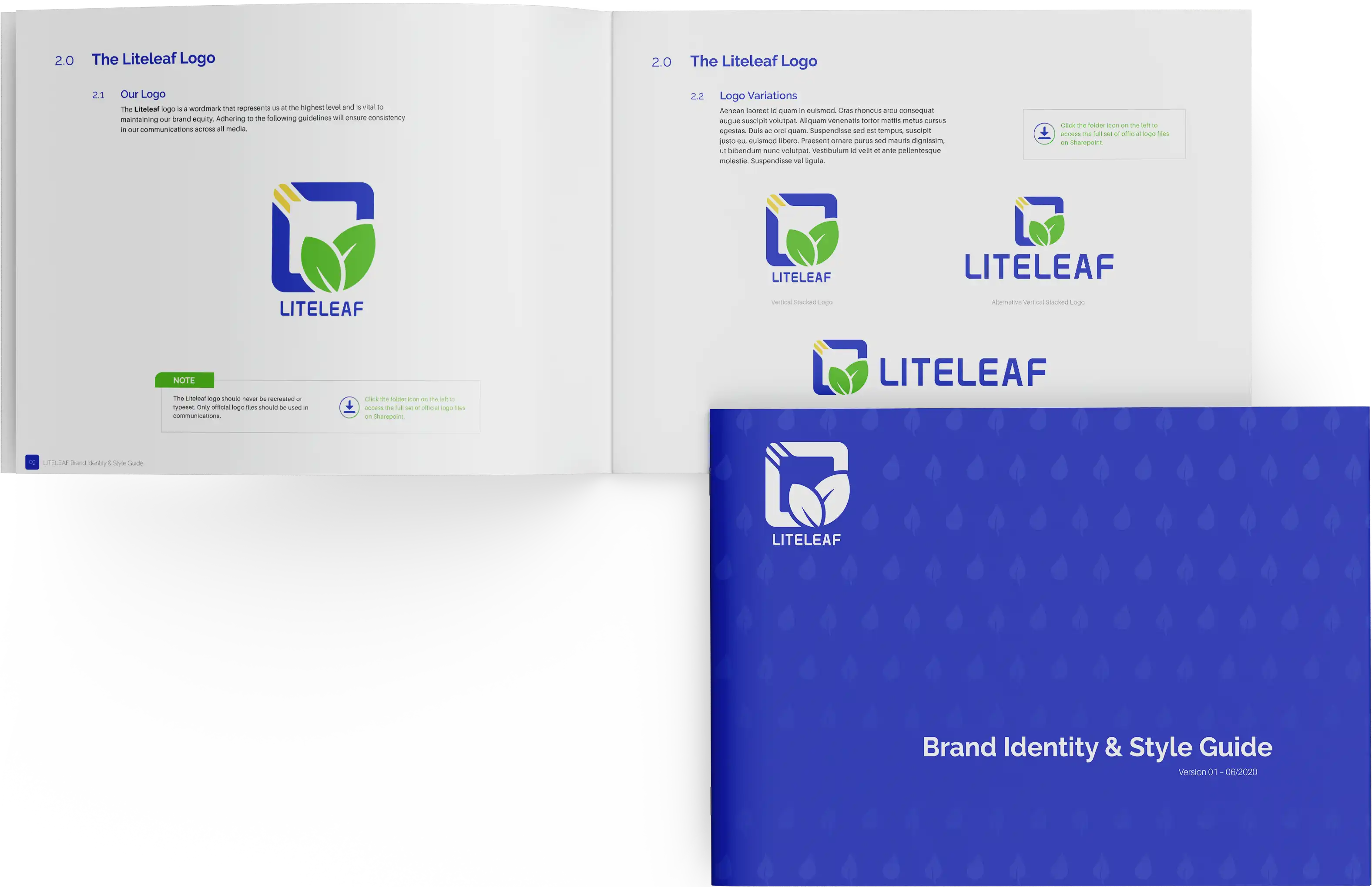
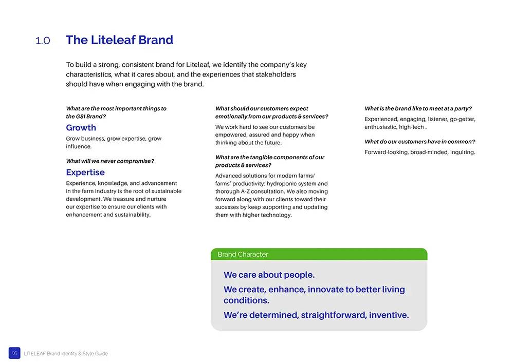
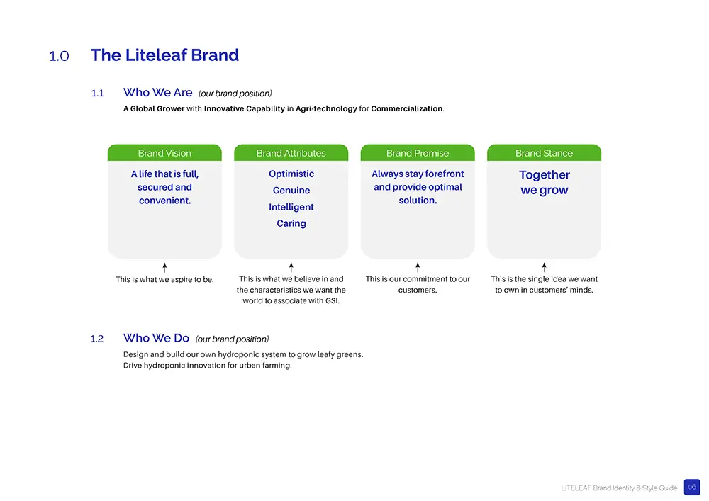
LITELEAF
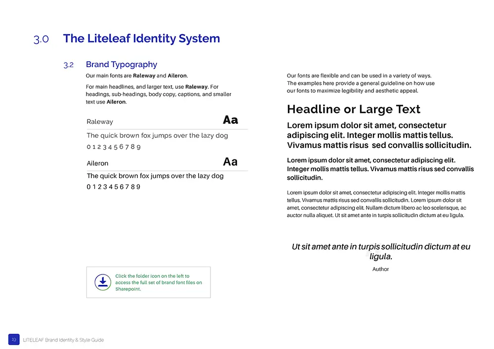
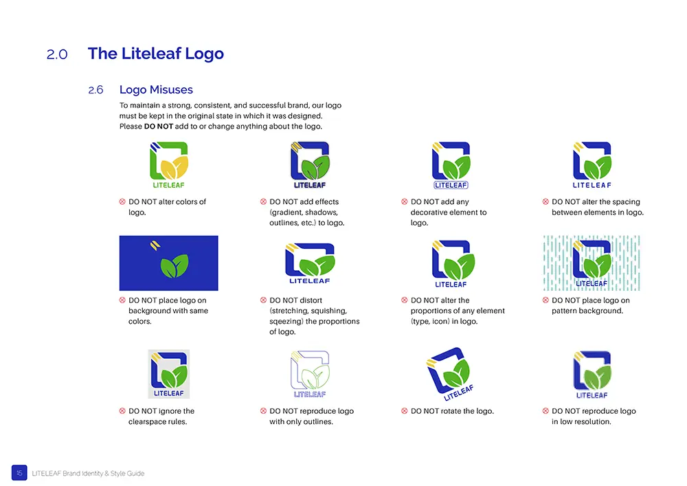
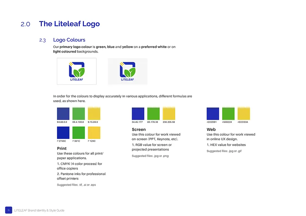
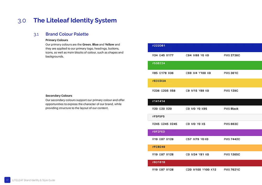
For Liteleaf, the priority was to establish a brand that could speak confidently to investors. The logo set the foundation for a broader system of geometry and colour drawn from water, plants, and light. This system shaped the design of stationery, templates, and other identity assets, giving the company a professional and consistent presence.
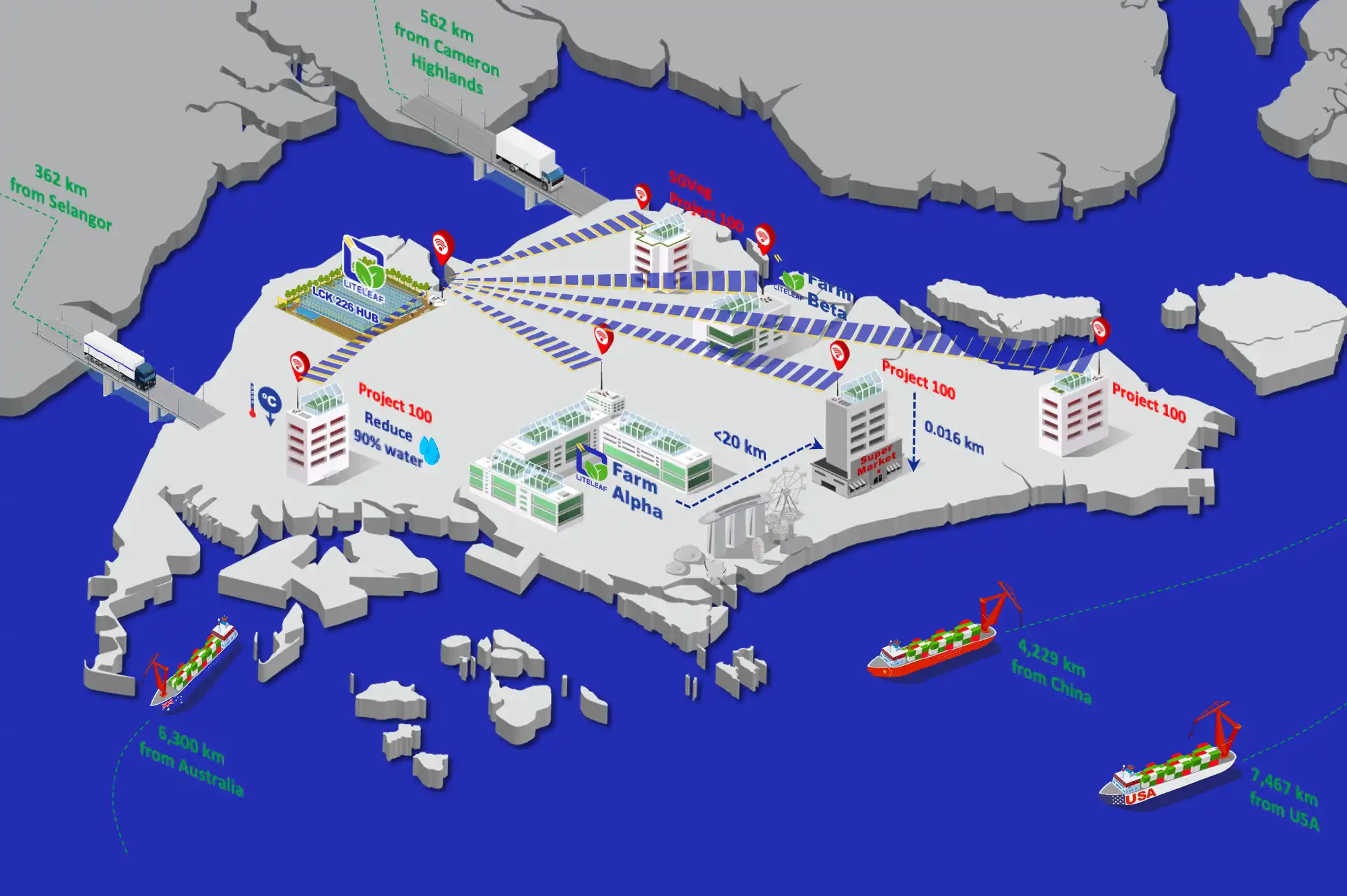
Building on that framework, we created the communication tools Liteleaf needed for investor engagement. Presentation decks and roadmaps were developed with infographics, diagrams, and sector illustrations to explain strategies such as distributed farming and circular economy models. These materials translated complex plans into visual narratives that investors and partners could understand easily.

GROW SYSTEMS INTERNATIONAL
GSI’s challenge was different: the company needed to present itself as an engineering partner while staying rooted in agriculture. Its brand system drew on water and growth, expressed through curved lines, rounded corners, and a palette of green and blue. These elements softened the technical tone, creating a visual language that was precise but approachable. Clean grids and white space kept layouts ordered, allowing technical content to sit alongside imagery of plants and systems.
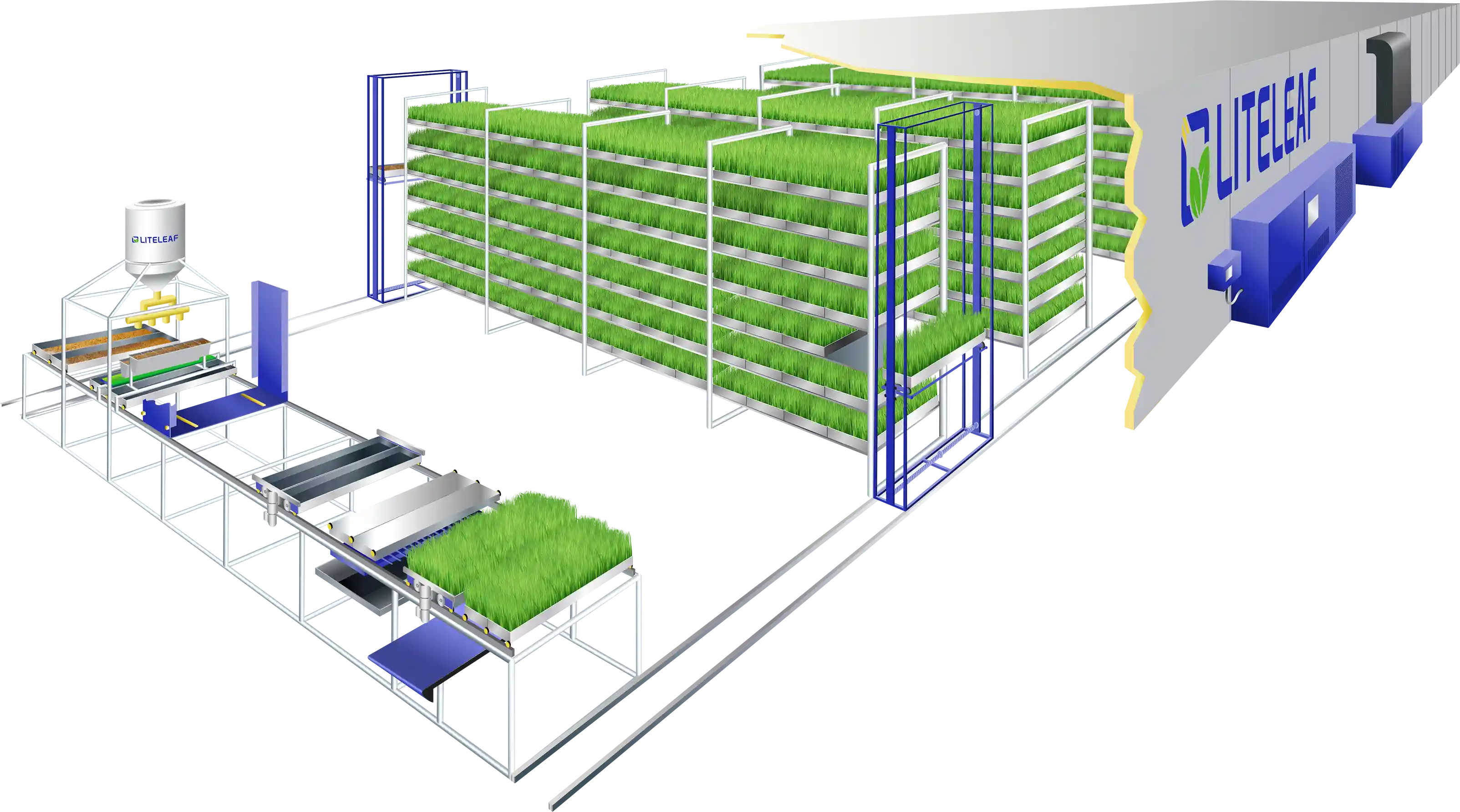
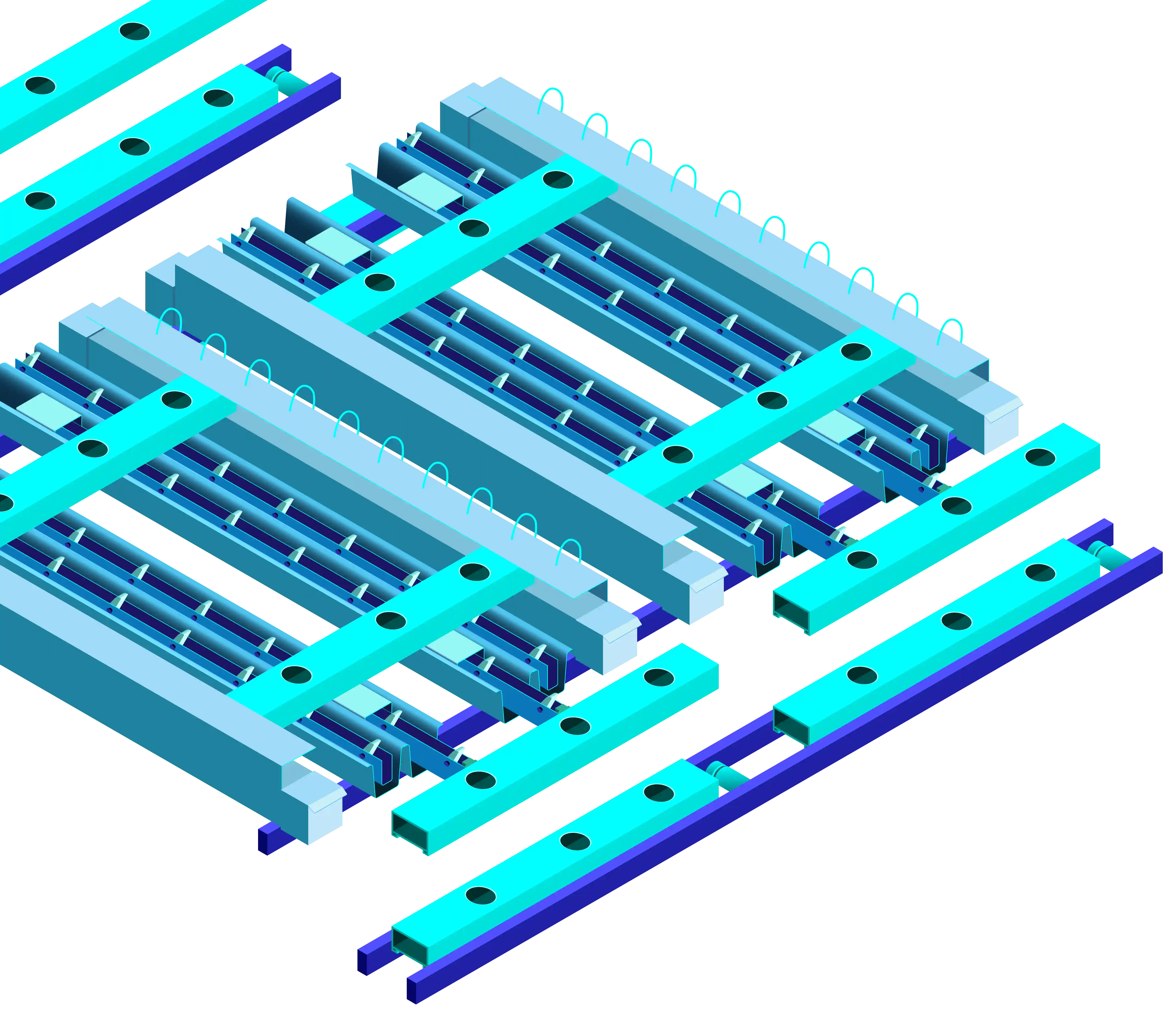
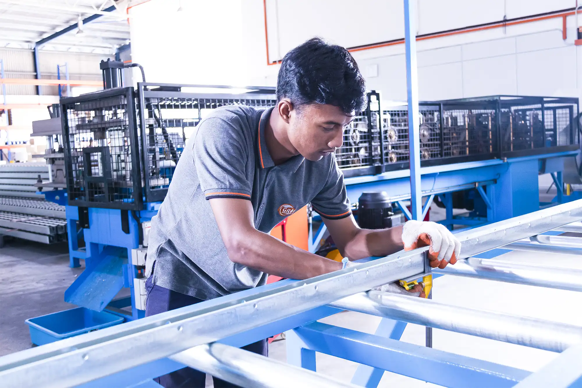
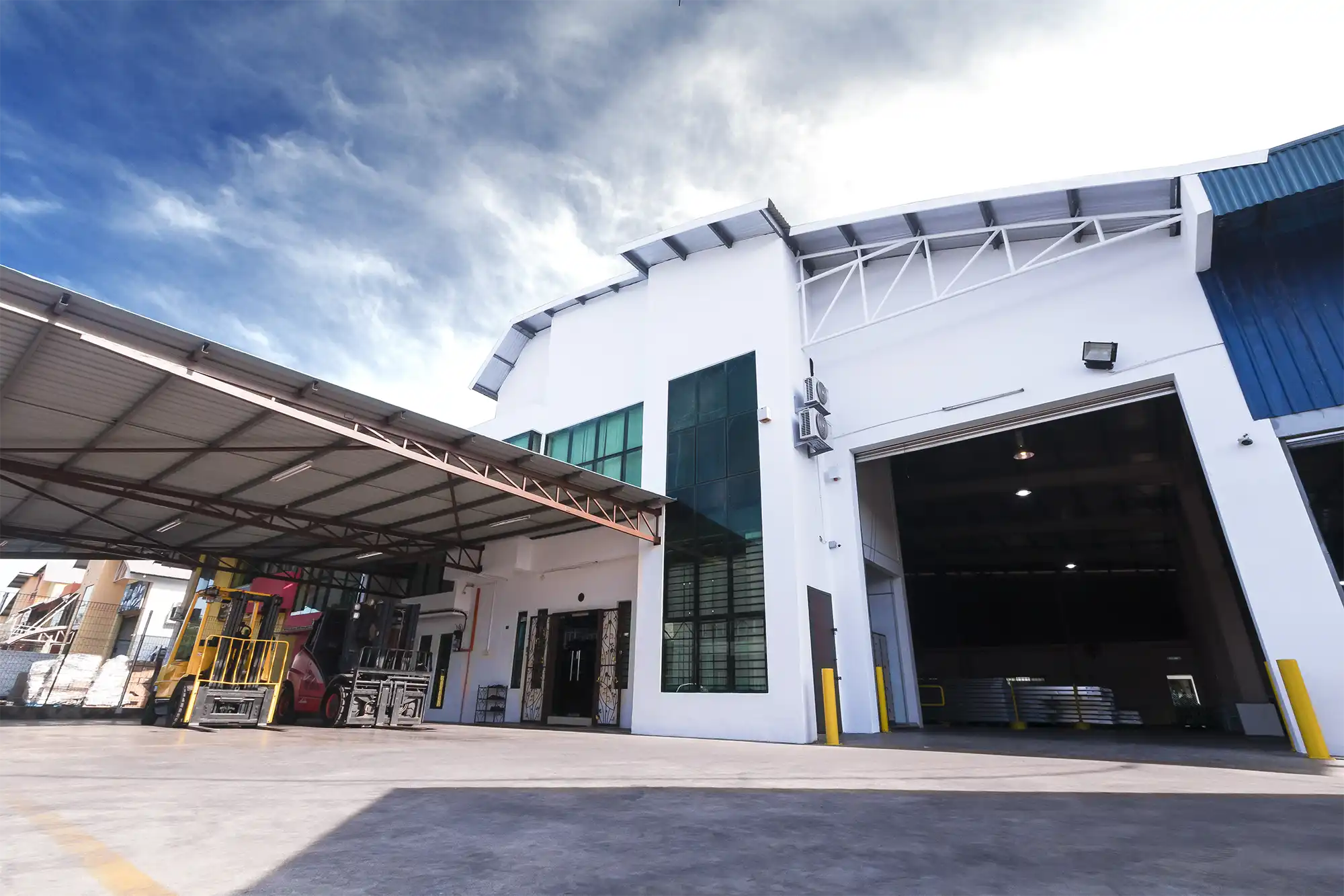
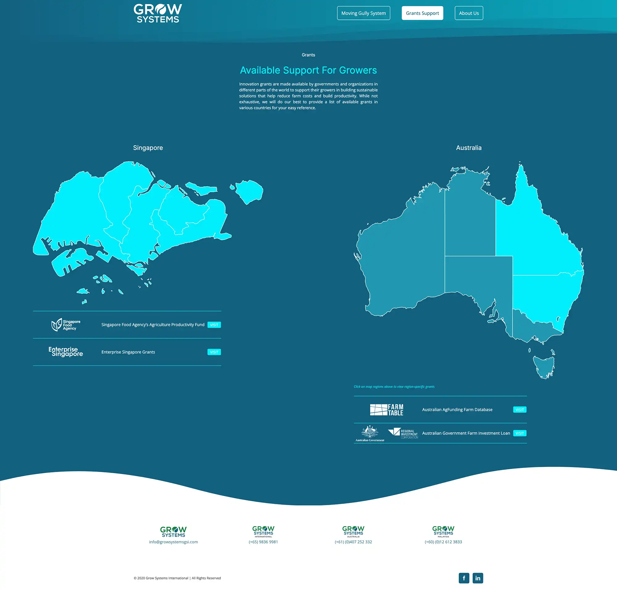
The identity extended into practical tools: stationery, brochures, and marketing materials that combined technical diagrams with straightforward layouts. Infographics were developed to explain how GSI’s solutions worked, particularly the Moving Gully System, making complex processes easier to understand at a glance. The website introduced the company and its systems, supported by photography from farms and workshops in Singapore, Malaysia, and Australia.


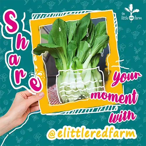
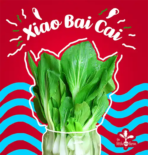
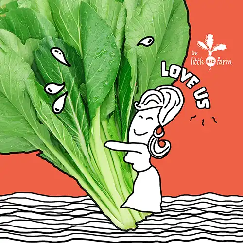
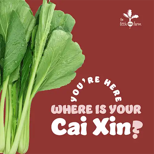
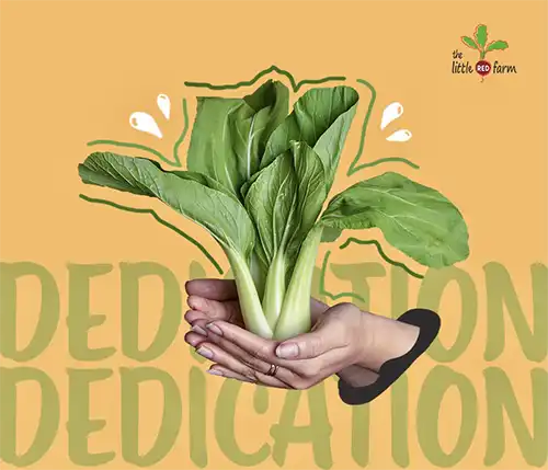
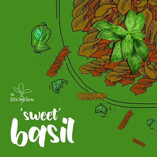
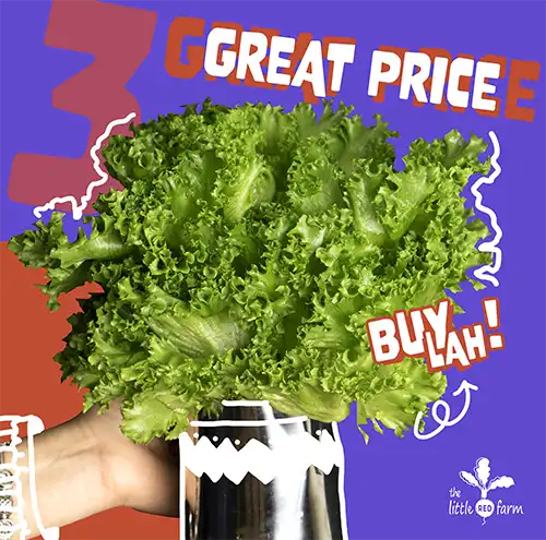
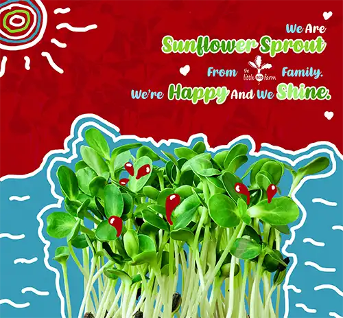
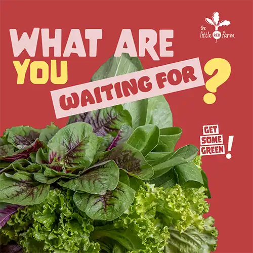
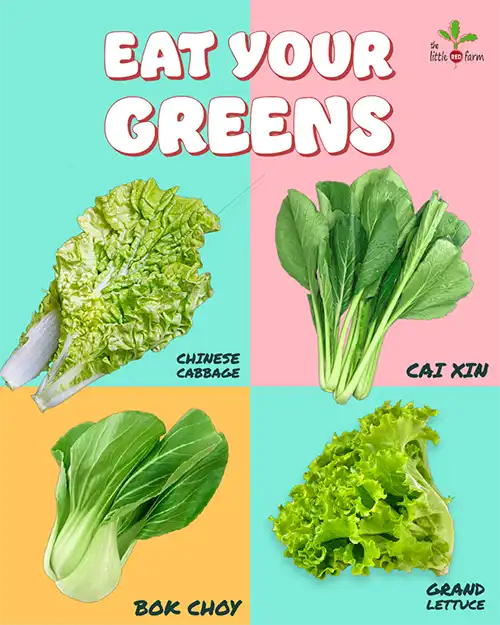
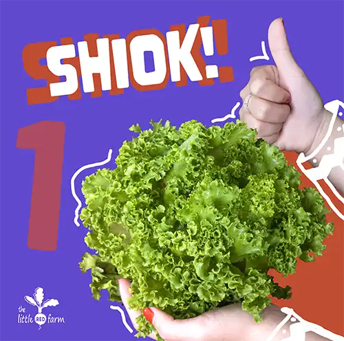
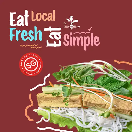
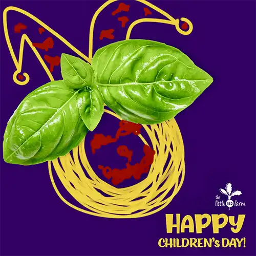
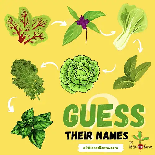
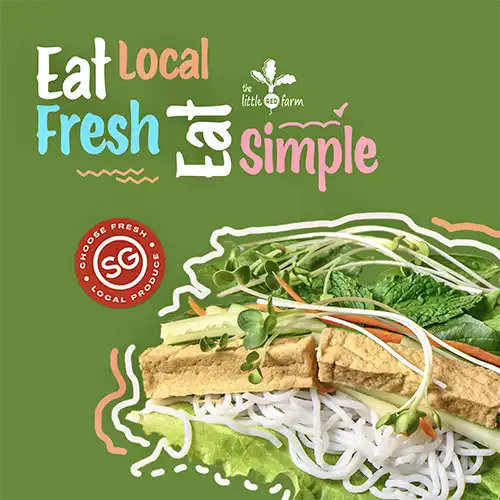
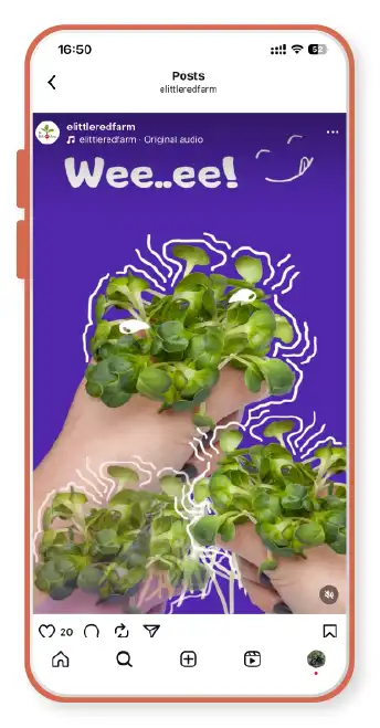
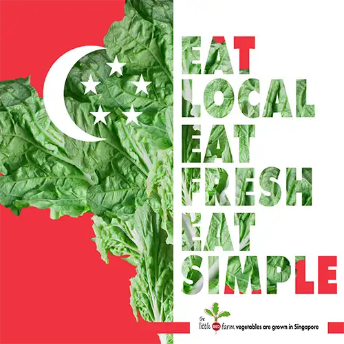
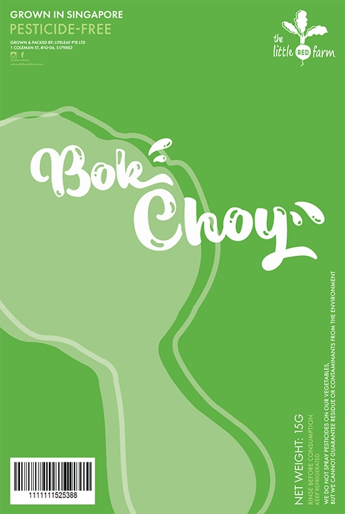
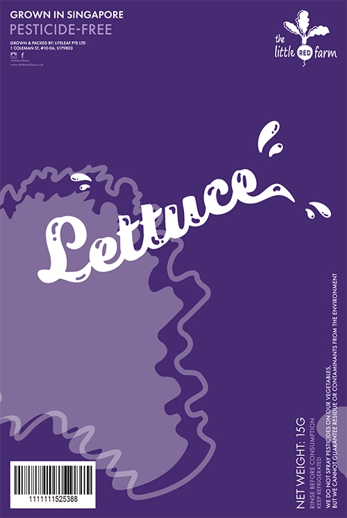
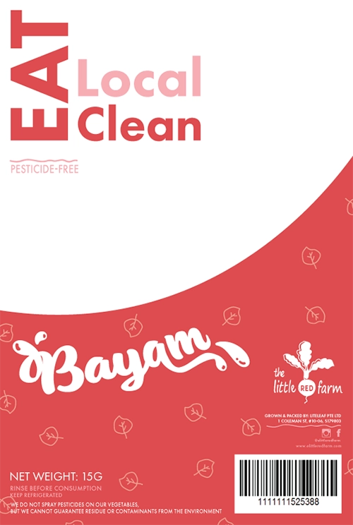
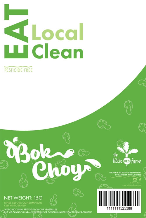
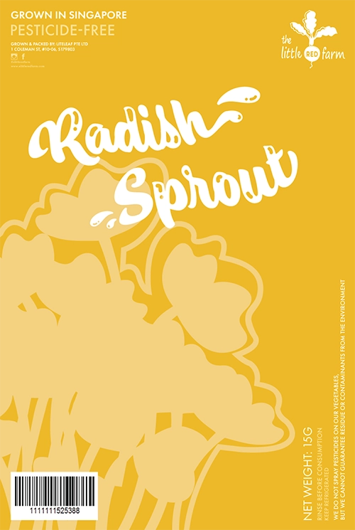
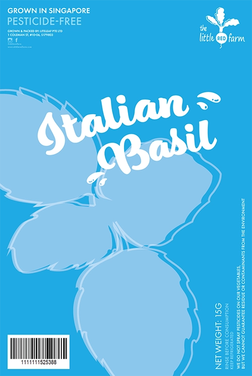
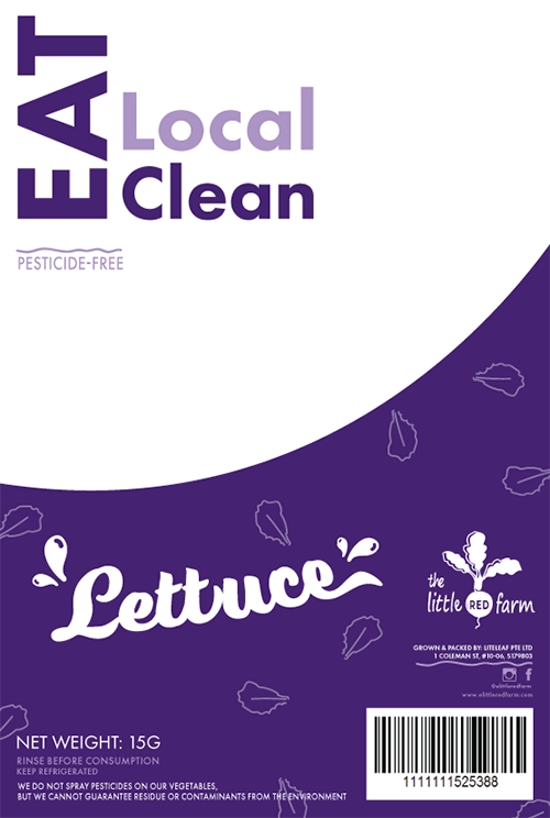
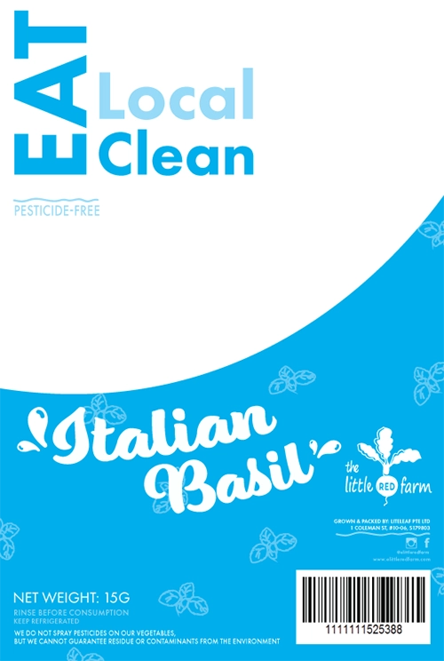
THE LITTLE RED FARM
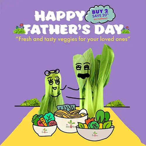
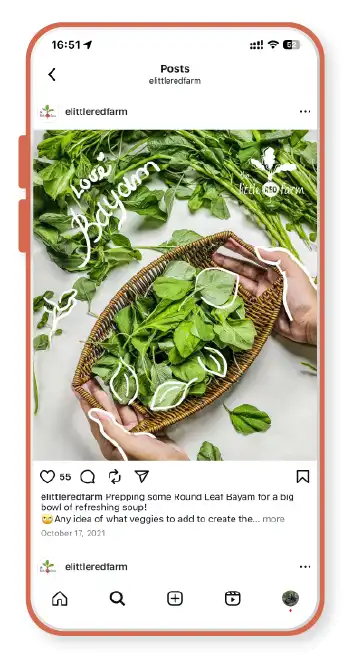
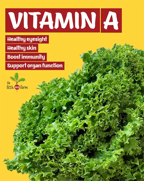
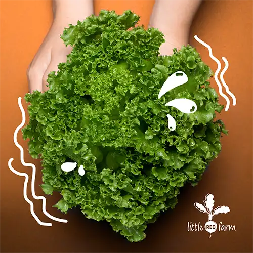
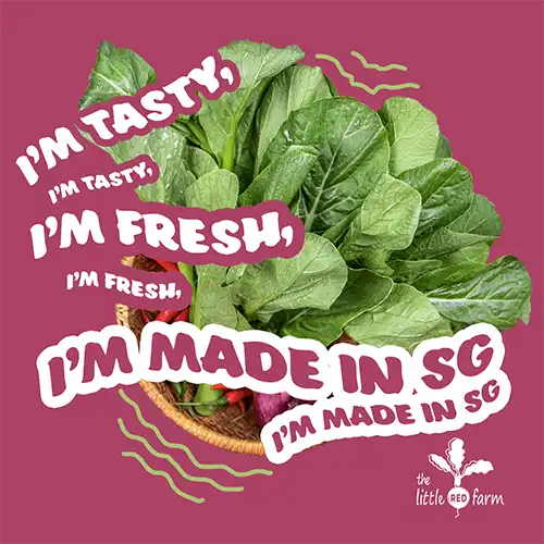
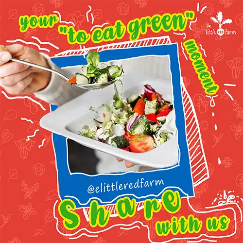
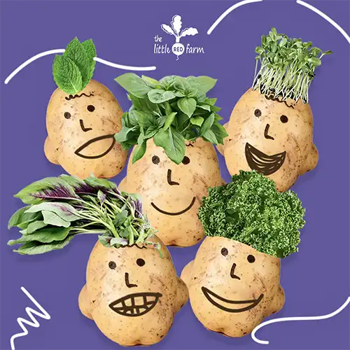
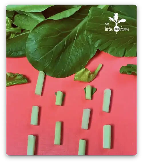
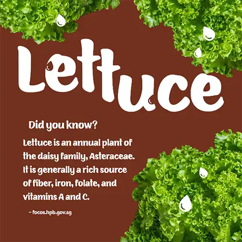
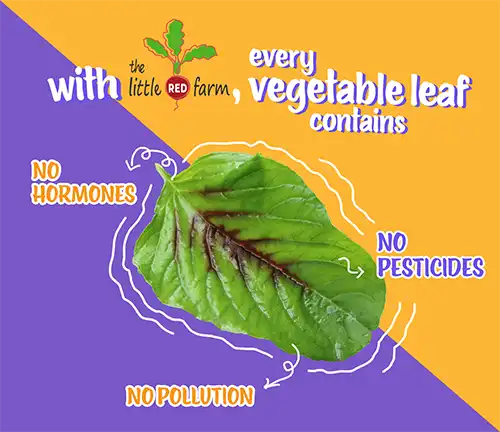
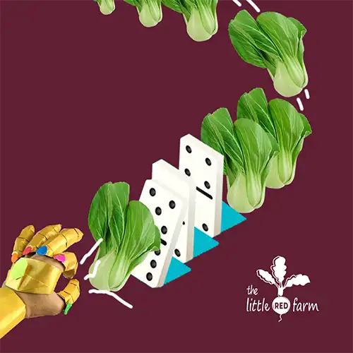
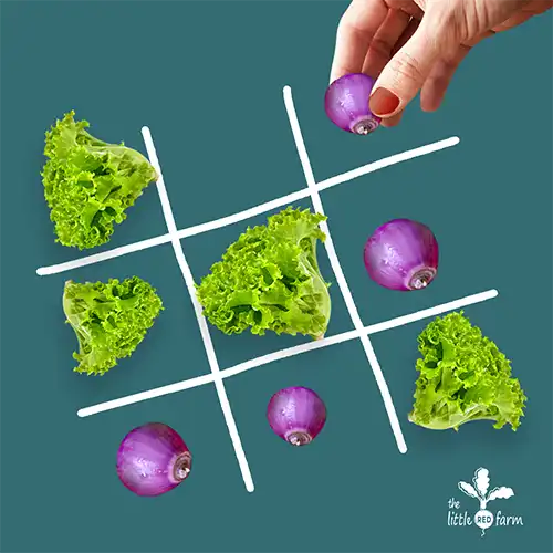
At the consumer end of the group, The Little Red Farm required a brand that shoppers could recognise instantly on shelves and online. The logo and colour system were designed to feel approachable and distinctly local, with a hand-drawn quality that set it apart from the corporate tone of Liteleaf and GSI. The brand voice was playful and quirky, balancing humour with authenticity. Packaging and labels carried this energy through to retail, making the produce easy to spot and hard to forget.
We extended this personality into social media. Photography and animated graphics showcased the vegetables in lively, unexpected ways — from meal preparation to playful studio setups. Posts were created almost daily, giving the brand a constant presence and a direct line to consumers. The rhythm of colour, wit, and visual surprise kept the feed feeling fresh.